FIX-IT-FRIDAY - NO.47- "Pinball Baby!"

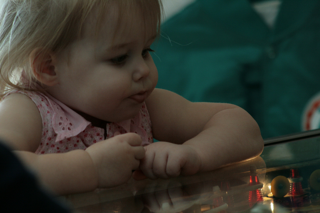 This week's Fix-it-Friday was set to be a challenge. The image was cute, but completely underexposed. The background was green and distracting (and I didn't like it in relation to her pretty pink dress), coupled with a nasty intrusion to the picture in the bottom left hand corner. Somehow the image was dark and imposing and needed some serious cheering up :D!!
I decided this week to have a go and get as far as I could with Gimp. I love this program for editing, but there are a few things I have not yet fully figured out! I'm sure they are possible, I just don't know how yet!
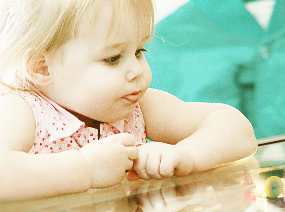
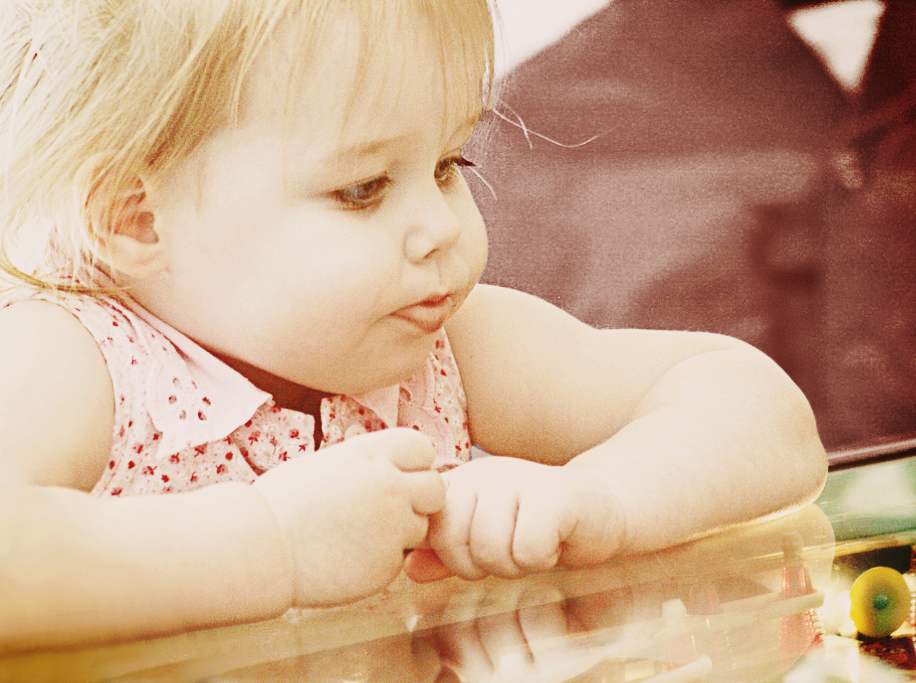
Fix #1

- The first thing I did was duplicate the image 4 times. The first was a normal duplicate. The other three were all screen layers @ 100% opacity! This brought the image immediately lighter, but lost a lot of contrast and interest. and the forth was a soft light layer. However I left it for now.
- Next I added a high-pass sharpening layer at 76% opacity & set to overlay.
- I then added a hue layer, of a light beige colour set at 22% opacity.
- I duplicated the hue layer and set it to soft light (same opacity).
- I merged all visible layers (ensuring that the original image was invisible) and then duplicated the merged image.
- Then I set to work cloning out the bottom left hand corner to re-create her arm and a portion of the pinball table. I have done a lot of cloning in the past, so I was happy to try this. After I had cloned it, I healed it a little (to blend it down better) and smudged it. I may have also decreased the layers opacity a little to make it less obviously fake (I can't remember).
- I then cropped out a bit on the left and right to take out some of the more fake looking parts and some of the distractions.
My problem now was that I didn't like the background and the image lacked pizazz!
Fix #2
- I used a colour boost script and fiddled with the layers until I liked what I saw.
- Great! But I still have that green in the background and I still don't like it!
I couldn't work out what to do with it in Gimp so I headed into PSE7.
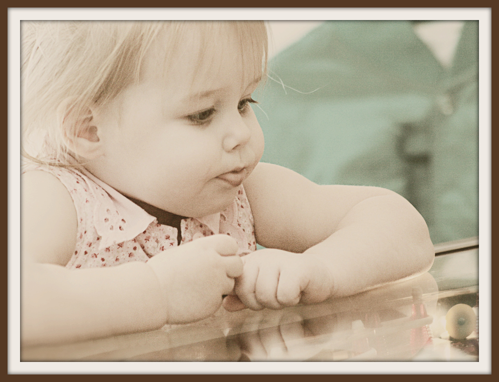
Fix #3
- I opened my saved image in ACR and tweaked it there just a touch, then I opened it.
- I duplicated the base layer (I always do that before I change anything)
- I used the smart brush in chocoholic mode to select the background which made a great colour change all for me :D
- I dodged her hair and the back of her head a little as they were becoming a little too bright.
Fix #4
- Next I applied Coffeeshop Johnna's Tea-Party action (which I totally LOVE) and twiddled with the two action layers. This brought out the pink in her top again and made the background more in keeping with the rest of the image ~ looking good!
- I used Coffeeshop Perfect Portrait action, but turned off a fair few of the layers, only using the soft skin (reduced to about 35% opacity), white eye, bright eye (again reduced opacity to make them look real, but still popping), the vignette layer (lowered again, but this punched out the pinball machine a bit better for me) and colour boost but only very lightly.
- I dodged the shadows very lightly on her bottom lip as the line on them was looking a bit harsh.
Now I was VERY happy, but I always like to frame my edits and there are also a couple of effects that I often like to try in Picnik, so I thought I'd just give them a go...
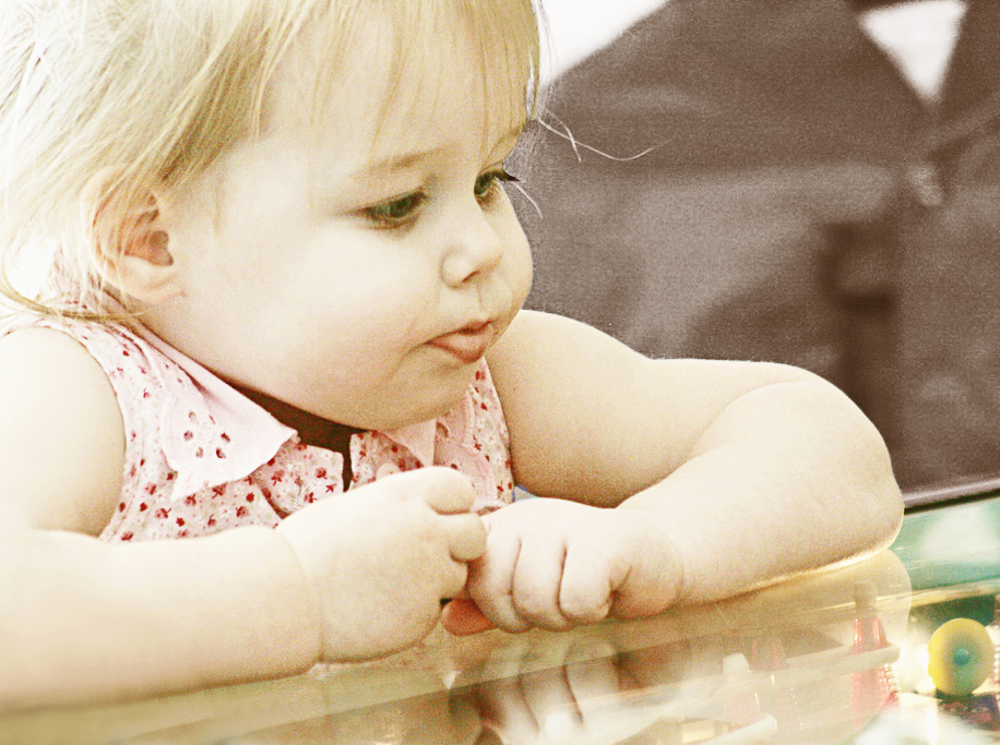
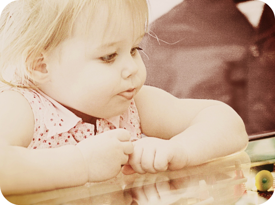
Fix #5
 For this one I used my 2nd gimp jpg and applied the faded daguerreotype curve, faded out and allowing a touch of colour back in.
 Framed.
Fix #6

- I took my PSE edit and applied the 'polaroid' curve to it.
- Framed with a polaroid frame ~ easy!
I do like the effect of this, but the image seems to have lost some clarity ~ however I recognise this can be part of the whole polaroid effect! :D
Fix #7
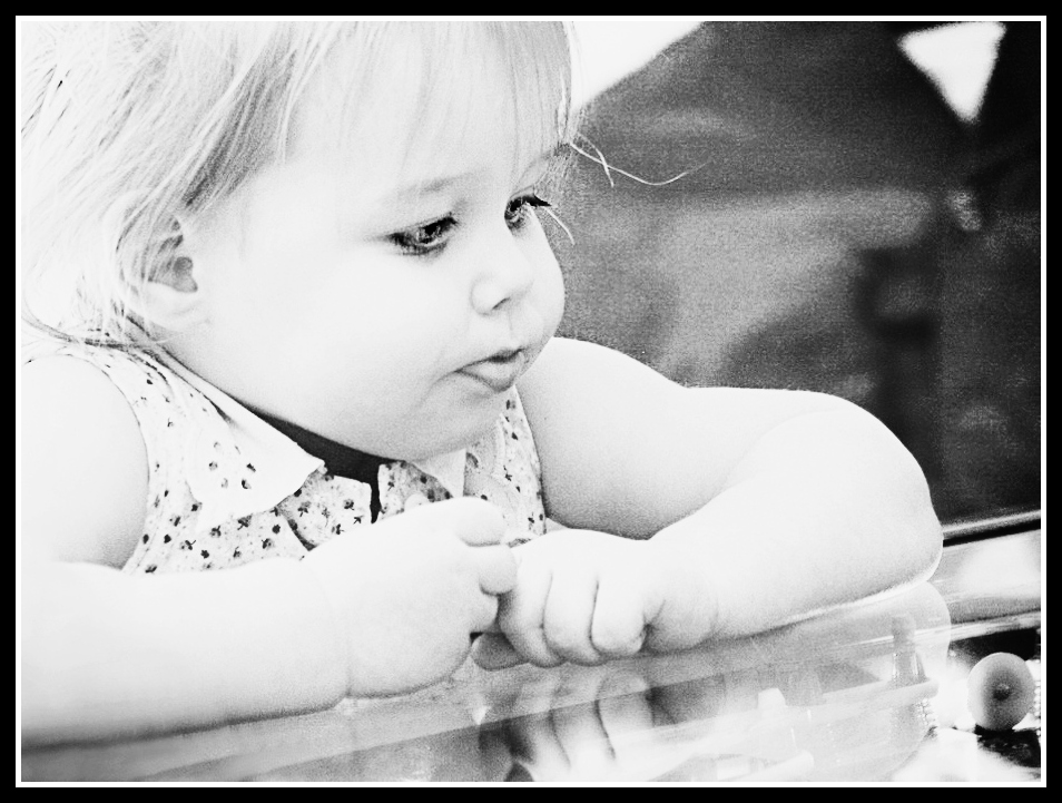
Again using the PSE edit I just completely desaturated the image and then used a basic s curve to create the contrast.
Using the touch-up tools I then used the 'bright eye' and lightened her eyes right up. Somehow eyes have a tendency to really get lost in a B&W.
I also used the mascara tool lightly over her lashes to enhance them.
Framed with a basic black border.
Fix #8
Lastly I took my PSE edit and applied the faded daguerreotype curve which I then faded out to a large extent and bled a lot of colour back in, but I liked the lightness it added.
I then added rounded corners for that 'retro' look that I thought this was lending itself to rather nicely to :D
_______________________
It was a challenge this week, but I did enjoy it and I think I have achieved some nice effects. I'm not sure which is my favourite actually! How about you? What do you think?
BTW - I edited all of this before I set to looking at how the 'pro's' did it ~ I like to do that to test myself!
One thing I could have done was run Noiseware to remove the 'fuzz' on the picture, but I decided I rather liked it and that it fitted in with my edit on this one.


10 comments:
I think fix #3 is awesome. :) I've never used GIMP before, but I think you really came up with some wonderful edits.
I think I like 3 best too but it's hard to say...you have some great (and hard) work there!! I too like to do my own edits before checking out anyone else's. Makes it more of a challenge and more fun afterwards, I think! Thanks for sharing so much info...great job!
Wow, nicely done. I think #8 and #3 are my favorites :)
Wow...it's so great that you post all of your "how to's" on here. My fav is #8 but I like them all.
Wow, it's a hard choice! I think I like #2 and #5. They are all great though. Thanks for sharing your steps with us.
My favorites are #3 and #8.
Nice work!:)
I didn't want this post to end! Every single picture was gorgeous and your commentary helped so much to understand the process! And GIMP showed up this week! Yay! Layers and I don't get along so well in Gimp, but your directions help me to understand it all. Loved them all, but 3 and 5 just bowled me over!
#5 is my pick. She is completely beautiful.
Wow. I learned a lot from Fix #1. I’ve never attempted to adjust exposure using the blending modes like that. Very clever!
thanks for your comment on my edit! I loved looking through all the different fixes you did. Each one emphasizes something different about the picture and looks great! Good work!
Post a Comment