Showing posts with label tutorial. Show all posts

Friday, 3 October 2014

Changing image sizes on Blogger


[If you need help importing images to you blog, THIS POST might help you. It's specific to Flickr, but many of the principles can also be applied to importing from other sites.]

Changing the size of an image

You can do this very simply by clicking on the images in 'compose' mode. You will be given a few choices. 
  • Original size is not usually a good option, unless you are maybe using a smaller image. You never want to make an image bigger than it's original dimentions because the it will become pixelated.
  • XL is 640px on the long edge and fine for most blogs, but photo blogs it can be a little small in these days of large screens!
  • L (400px), M (320px ) and S (200px ) are not really very useful, but  do I occasionally use them if I want to put images side by side. 
If you want to change the size to anything other than the defaults you have to head into HTML mode.

The first challenge is to find the image you want to resize! It's actually easier if you are doing them all because you can use this trick: press Ctrl+F on your keyboard and in the top right hand corner of your screen a little box will appear. Punch in 1024 and every instance of that search will be highlighted in the your post (btw -  you can use this on any web page when searching for something ~ VERY useful!)

NB~ if you have used Option One to import your images via the url, you may find Blogger has auto-resized them and made them all smaller. In which case you need to search and replace the number 320 instead of 1024.

The pictures below shows you the code for a single image (it looks a tiny bit different depending on which method you used to import your image to Blogger). You might not be able read my notes in red on the first picture, but essentially you need to replace the number 1024 with either 920 if the image is landscape, or 720 if it's portrait. These are standard blog sizes, but you can actually choose any size you like these days!

( I find 920 width is a good compromise of large size and reasonable loading speed. And I choose 720 height as ideal because the pictures fit most screens without needing to scroll! Many people use 800 for both width and height ~ it's really up to you! )

Once you have changed the 1024 number you then need to completely obliterate the other measurement! (As I have shown on the first image - delete all the code I have put a line through)


Adding Flickr images to a Blogger post.

When you first open your Flickr page this is what you will see ~ your photostream.


Setting up JF Fridl's FB Plugin for LR4


At the request of a fellow photographer I've put together a few screenshots to help with SETTING UP JF FRIEDL'S FACEBOOK PLUGIN FOR LR (4) ~ to upload to professional pages.

Starting from the plugin setup: At the very top left of LR's menu bar, under 'File' ~ select 'Plug-in Manager...'  & this is the window that pops up. Check everything looks a bit like this...

Wednesday, 27 July 2011

"Laughter" ~ Good-to-WOW! ~ 'walk through'!


Ok, so here, as promised is my ' Good to WOW' tutorial (for LR3).

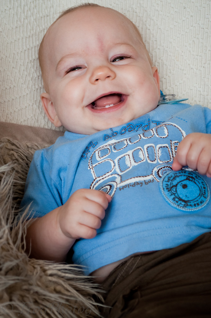
Remember this shot ~ my original SOOC...


OK, so what do I see?
A sweet shot of my son laughing, but it's underexposed. That's the main issue here. When I shoot indoors it's a juggling act with ISO and exposure. I often plum for lower ISO and a little underexposure, knowing I can almost always sort it out PP and thereby avoiding the introduction of excessive camera noise.
He looks a bit too pink maybe and his skin tones are a bit uneven.
It's pretty sharp, but most (if not all) images need a little bit of sharpening ~ that's kind of par for the course.
IF I were going to take this into PSE I'd also add a little canvas at the top of him as he is SO near the top of the image (but I'm not this time, maybe another..!)

My basic edit looks like this...


I used my very own one click edit ~  'Light & Bright Portrait (RAW)' preset.
 (click on the 'FROGPHOTOG FREEBIES' tab at the top of this blog to find all my presets on a  downloads page)

Following that, I used 'fine sharp' (another of my presets)  ~ I find this is great for pretty much anything, from portraits to landscapes, but it does need a little bit of extra-fine tuning sometimes!

Tip #1 ~ Sharpening Tricks...


Click 'fill' over on the top-left, in the Navigator panel, and make sure the area that is most important to you is in the middle as shown above.

Next go to the 'Detail' panel on the right-hand side.
Now, holding down the ALT key, click on the 'masking' slider (as circled) ~ you will now see the above effect. It works like a 'layer mask' showing you the amount of masking you are using. You are effectively masking OUT the sharpening effect of the sliders above. That may seem crazy, but mostly you don't want to OVER sharpen, especially hair and fur, and also, the more you sharpen the more noise you introduce too, so masking out the UNNECESSARY sharpening is a really good thing to do!
You can use the ALT key on the other three sharpening sliders too, to see more clearly the effect they are each having. Go on, have a play :-)

So, from the screen shot above, you can see how I left things!

I then applied my 'Std NR' preset ~ a preset I designed to just loose any low-impact noise, without compromising on detail. If my shot had been taken at a high ISO, or if my sharpening had been more severe, I may have needed to use my 'Strong NR' preset

Lastly I bumped my exposure up a touch more (to +087) and used my 'frog vignette' preset (which is super-subtle!)

Done!
~ ~ ~ ~ ~ ~ ~ ~ ~ 

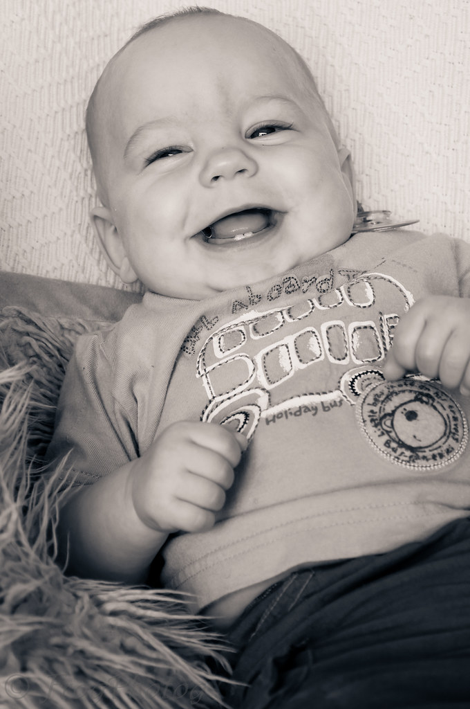
But I promised you a vintage and a BW.

Press Ctrl+' (or right-click and duplicate) ~ this creates a duplicate image (of course) to work on. I actually did that twice as I knew I wanted to create a BW too this time.

So for the vintage (which is not VERY vintage actually, sorry, but I still like it) here's what I did...

Tip #2 ~Time to add some split tone...


you can see my settings from the screen above, but really you can have some serious fun with this! Wherever you move those little sliders & squares (in the colours box), you can see a real-time preview of the effect they are having on your image. I  it!!

Tip #3 ~ I added a colour 'gradient filter'...


In your brushes panel (see top right-hand side) select the shaded rectangle ~ this is your gradient filter. It uses the same 'effect' settings as the brush (which is to it's right), but differently! Select 'colour' where I have marked circle number 1 (I know it says 'custom', but that's because I made changes to the default). Now click the coloured box at the bottom (marked 2) and select a colour for your filter.  
THEN drag your filter across your image, as marked by my long red arrow (you can drag at any angle and any amount depending on the area of the image you wish it to affect. You can also rotate it).
Lastly fiddle with the settings (marked 3) until you are happy. You can even go back and change the colour if you like.
IF you want to change anything to do with the location of the gradient you can also do that. A dot will appear in the middle of the area. If you hover around it, you can rotate the gradient, and move it around. You can also drag on the lines to push them closer together or pull them apart. It's very versatile.
For this shot I used a colour gradient, but you can choose from any of the 'effects' in the drop-down, and I often use this tool to even out under/over exposed areas in my pictures.
It is possible to even save your own customisations as new effects. Don't be afraid to play!! You only have to hit delete  (or reset THE PANEL) if you don't like what you've done :-)

Tip #4 ~ on/off...

If you want to check to see if you like the adjustments you made you can. Do you see where I marked on/off on the above screen shot ~ this does literally that. Like the eye button in PS(E), it turns the effect on and off. There is one on each panel and they are very useful :)


Finally I added some 'grain' (effects panel) ~ settings +15/25/50
and tweaked the vignette ~ -24/54/+36/84/0

& Voila!


~ ~ ~ ~ ~ ~ ~ ~ ~ 

Super-simple this... I used my 'Blue/Gold' preset (in the RAW set) and then sync'ed to the basic edit to re-set exposure, etc...

Tip #5 ~ syncing...


Select the image that you want to sync TO (i.e. the one with the correct settings ~ marked 'A' in the scrolling gallery at the bottom) and THEN the one you want to copy them into ( the one you're working on ~ marked 'B'). The highlighting should appear slightly brighter on the image you clicked first.
Now click the 'Sync' button (1) ~ the pop up box will appear. Select everything you want to sync. In this case the circles marked (2). When you press 'Synchronize' (3) these settings will be copied onto your current image. (Ctrl+Z to undo (as always) if you do it wrong, or don't like the result!)

You can use this very handy tool to batch edit. SO if you have several images taken in the same lighting, you can edit one and then sync all the other too it! It saves a tonne of time, as then you only have to make minor tweaks of each image, instead of starting from scratch over and over!

You can actually use in 'Library' mode too, but you need to use the 'sych settings' button there ~ not the 'sync' one (confusing I know!)

To finish finish off this BW I adjusted the exposure a touch (+78) and clicked at the top to convert it to Black & White. Although it was already BW, this made a slight difference that I liked.

Finished!!


To conclude ~ a little something to make you smile...


If you have any questions about anything here please fire away in the comments box!
I hope some, any, or all of this has been helpful to you, especially if you are using LR3 (and if you're not yet, but hope to in the future, then bookmark me!!)  :-)
I'm sorry if it seems like I'm teaching my Granny to suck eggs to some of you, but I've assumed knowledge of nothing so as to try and avoid anyone feeling left out!

I look forward to seeing your edits everyone..! 

Please link up below.

I ♥ FACES

I ♥ FACES ~ WEEK 10 - “JUMP FOR JOY!”

I ♥ FACES - Week 7 - "I Wanna Dance!"

I ♥ Faces - Week 2- “Best Face"

I ♥ Faces - Week 27 - Pets

I ♥ Faces - Week 31 - "Crazy, Silly, Funny Faces!!"

I ♥ Faces - Week 35 (ii) - “PhotoJournalism"


Social Butterfly Award :D

Ten Minutes From Home

TMFH
Capturing Your Memories

Communal Global

You Capture

Photobucket

5 Faves Friday

FFFpub copy
<center><a href="http://frog-photoblog.blogspot.com/search/label/5FF"><img src="http://farm3.static.flickr.com/2776/4427279169_ddd077ec9b_m.jpg" width="212" height="240" alt="FFFpub copy" /></a><center>

BEST SHOT

Photobucket

SOOC Saturday

Followers

Recent Visitors

Instagram Gallery

  © Free Blogger Templates 'Photoblog II' by Ourblogtemplates.com 2008

Back to TOP